php
<div class="nav-links">
	<div class="single-nav-links">
		<div class="nav-next right">
			<?php next_post_link( '%link', '次のページ <i class="fa fa-angle-right" aria-hidden="true"></i>', true ); ?>
		</div>
		<div class="nav-previous left">
			<?php previous_post_link( '%link', '<i class="fa fa-angle-left" aria-hidden="true"></i> 前のページ', true ); ?>
		</div>
	</div><!-- single-nav-links -->
</div><!-- nav-links -->
css
#sidebar .nav-links a { /* 投稿下のナビゲーションリンクの設定 */
	color: #333333;
}

#sidebar .nav-links a:hover { /* 投稿下のナビゲーションリンクのホバーの設定 */
	color: #24ccc6;
	border: 1px solid #24ccc6;
}

.right {
	float: right;
}

.left {
	float: left;
}
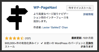
1.WP-PageNaviをインストール
※設置する際に設定は必要ない。
2.ナビを設置したい箇所に下記のコードを記入する。
<? php wp_pagenavi(); ?>
3.スタイルなどの細かい設定をする。
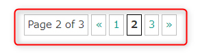
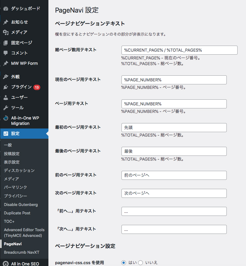
管理画面の「設定」→「PageNavi」で表示設定をする。
functions.phpに記入
// target="_blank" の削除
function remove_target_blank($content) {
return str_replace('target ="_blank"', '', $content); }
add_filter('the_content', 'remove_target_blank');
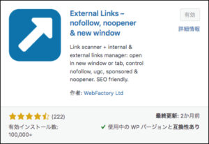
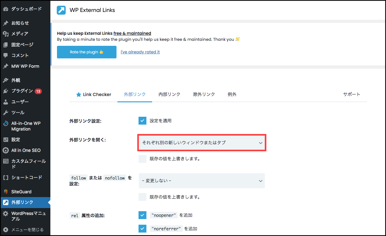
1.「WP External Links」を追加して有効化する。
html
<div id="splash">
	<div id="splash_text">
	</div>
</div>

<div id="container">
	<p>ローディング後、この画面が見えます。</p>
</div>
css
/* Loading背景画面設定 */
#splash {
	/* fixedで全面に固定 */
	position: fixed;
	z-index: 999;
	width: 100%;
	height: 100%;
	background: #333;
	text-align: center;
	color :#fff;
}

/* Loadingバー中央配置 */
#splash_text {
	position: absolute;
	top: 50%;
	left: 50%;
	z-index: 999;
	width: 100%;
	transform: translate(-50%, -50%);
	color: #fff;
}

/* IE11対策用バーの線の高さ※対応しなければ削除してください */
#splash_text svg {
	height: 2px;
}


/*========= レイアウトのためのCSS ===============*/

#container {
	width: 100%;
	height: 100vh;
	background: #ccc;
	display: flex;
	justify-content: center;
	align-items: center;
	text-align: center;
}

a {
	color: #333;
}

a:hover {
	text-decoration: none;
}
js
//テキストのカウントアップ+バーの設定
var bar = new ProgressBar.Line(splash_text, { //id名を指定
	easing: 'easeInOut', //アニメーション効果linear、easeIn、easeOut、easeInOutが指定可能
	duration: 1000, //時間指定(1000=1秒)
	strokeWidth: 0.2, //進捗ゲージの太さ
	color: '#555', //進捗ゲージのカラー
	trailWidth: 0.2, //ゲージベースの線の太さ
	trailColor: '#bbb', //ゲージベースの線のカラー
		text: { //テキストの形状を直接指定
			style: {//天地中央に配置
				position: 'absolute',
				left: '50%',
				top: '50%',
				padding: '0',
				margin: '-30px 0 0 0', //バーより上に配置
				transform: 'translate(-50%,-50%)',
				'font-size': '1rem',
				color: '#fff',
			},
			autoStyleContainer: false //自動付与のスタイルを切る
		},
	step: function(state, bar) {
		bar.setText(Math.round(bar.value() * 100) + ' %'); //テキストの数値
	}
});

//アニメーションスタート
bar.animate(1.0, function () { //バーを描画する割合を指定します 1.0 なら100%まで描画します
	$("#splash").delay(500).fadeOut(800); //アニメーションが終わったら#splashエリアをフェードアウト
});
html
<a href="#" class="btn03 pushdown"><span>7-1-15 下に押し込まれる(立体が平面に)</span></a>
css
/* ボタン共通設定 */
.btn03 {
	/*影の基点とするためrelativeを指定*/
	position: relative;

	/*ボタンの形状*/
	text-decoration: none;
	display: inline-block;
	text-align: center;
	background: transparent;
	border-radius: 25px;
	border: solid 1px #333;
	outline: none;

	/*アニメーションの指定*/
	transition: all 0.2s ease;
}

/*hoverをした後のボタンの形状*/
.btn03:hover {
	border-color: transparent;
}

/*ボタンの中のテキスト*/
.btn03 span {
	position: relative;
	z-index: 2;/*z-indexの数値をあげて文字を背景よりも手前に表示*/

	/*テキストの形状*/
	display: block;
	padding: 10px 30px;
	background: #fff;
	border-radius: 25px;
	color: #333;

	/*アニメーションの指定*/
	transition: all 0.3s ease;
}


/*== 下に押し込まれる(立体が平面に) */

/*影の設定*/
.pushdown:before {
	content: "";

	/*絶対配置で影の位置を決める*/
	position: absolute;
	z-index: -1;
	top: 4px;
	left: 0;

	/*影の形状*/
	width: 100%;
	height: 100%;
	border-radius: 25px;
	background-color: #333;
}

/*hoverの際にY軸に4pxずらす*/
.pushdown:hover span {
	background-color: #333;
	color: #fff;
	transform: translateY(4px);
}


/*========= レイアウトのためのCSS ===============*/

body {
	vertical-align: middle;
	padding: 100px 0;
	text-align: center;
}

p {
	margin: 0 0 10px 0;
}
html
<a href="#" class="btnripple3">7-1-13 波紋がふわっと広がる</a>
css
.btnripple3 {
	/*波紋の基点とするためrelativeを指定*/
	position: relative;

	/*リンクの形状*/
	display: inline-block;
	margin: 0 10px 20px 10px;
	text-decoration: none;
	color: #333;
	outline: none;
}

/*波形の設定*/
.btnripple3:hover::before {
	content: '';

	/*絶対配置で波形の位置を決める*/
	position: absolute;
	left: 30%;
	top: 0;

	/*波形の形状*/
	border: 1px solid #333;
	width: 60px;
	height: 60px;
	border-radius: 50%;

	/*はじめは不透明*/
	opacity: 1;

	/*アニメーションの設定*/
	animation: 1s circleanime2 forwards;
}

/*波形が広がるアニメーション*/
@keyframes circleanime2 {
	0% {
		transform: scale(0);
	}
	100% {
		transform: scale(2);
		opacity: 0;
	}
}

/*矢印の設定*/
.btnripple3::after {
	content: '';
	/*絶対配置で矢印の位置を決める*/
	position: absolute;
	top: 30%;
	right: -20px;

	/*矢印の形状*/
	width: 5px;
	height: 5px;
	border-top: 1px solid #000;
	border-right: 1px solid #000;
	transform: rotate(45deg);
}


/*========= レイアウトのためのCSS ===============*/

body {
	vertical-align: middle;
	padding: 100px 0;
	text-align: center;
}

p {
	margin: 0 0 10px 0;
}